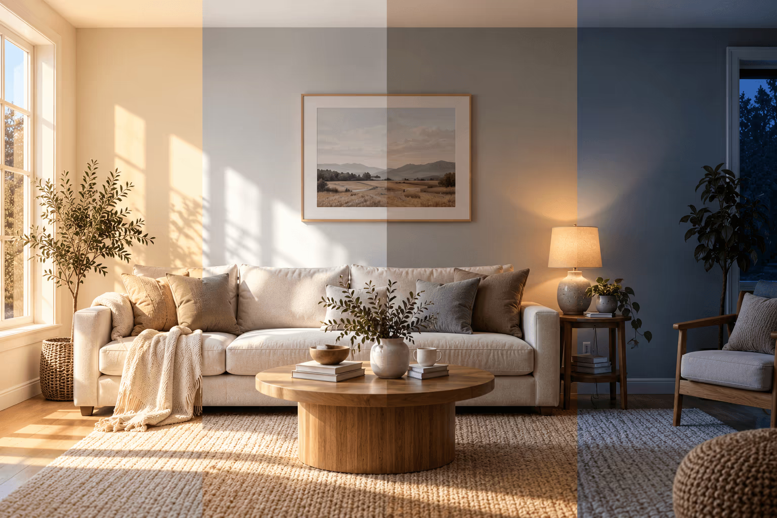
Perfecting the art of interior design requires analysis of multiple factors, including space, but light is arguably the most influential. As the sun gives way to the moon, the room's aesthetic and atmosphere can change. Designing to accommodate these changes is vital for preserving the space's intentional style and color choices. Using these tips will help DIY homeowners and color experts alike work with the ever-changing light rather than letting it ruin countless hours of design work each day.
Seeing How the Time of Day Transforms Your Walls
You may have noticed your rooms have a chameleon effect. A light shade of blue in a serene dining room can look more jarring once the afternoon sun hits it. Alternatively, a gray accent wall intended to make a place look upscale can become soulless after sunset.
These are tricks of the eye based on artificial light, such as table lamps and overhead fixtures, and on natural brightness. No color appears to remain static. As time moves, the appearance of the home becomes dynamic. This phenomenon is the illusion of light's temperature, and it can turn a series of conscious design decisions into daily upset.
Anyone who spends hours picking the perfect paint and carpet complement for a room will feel disappointed in the space if it looks nothing like their vision for half of the time they are in the house. Before major decision-making, homeowners and designers can work with the light instead of against it to craft a space that flourishes, despite the changing conditions.
Understanding the Basics of Light and Setting
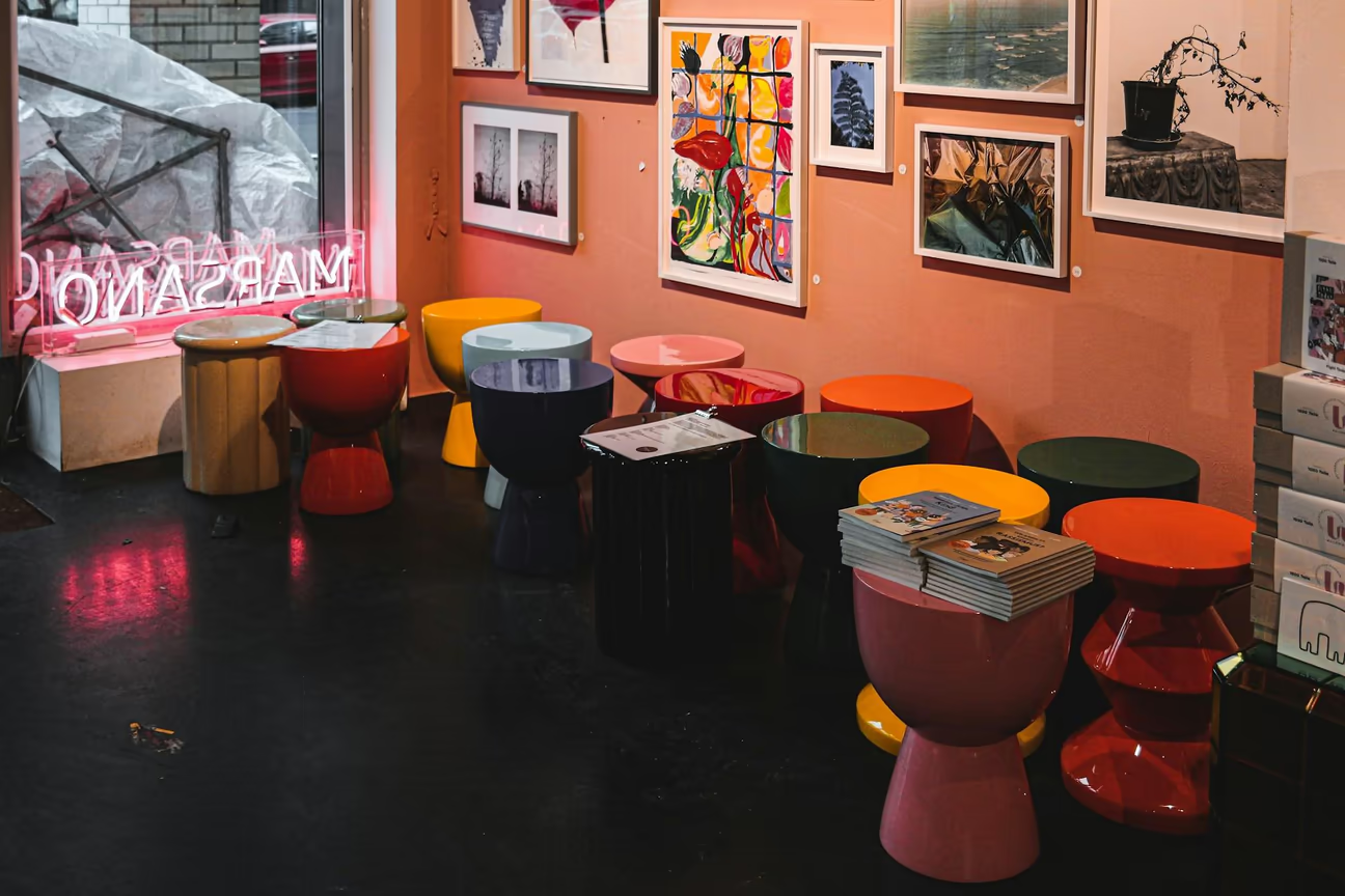
The most important element of light that changes indoor perception is temperature, not brightness. Color temperature is measured in Kelvin, and it describes whether light looks warm and amber or cool and blue-white , not how bright it is. Early morning and evening sunlight tends to sit lower on the Kelvin scale, giving rooms a warm, golden cast. As the sun climbs toward midday, natural light shifts higher on the scale and takes on a cooler, whiter appearance.
A shift of a thousand degrees Kelvin is quite noticeable and can change how a room feels. Homeowners may want to evoke a specific feeling in a room, whether it be alert and productive or cozy and calming.
Alternatively, you may try to obtain a certain color temperature for its benefits. For example, offices commonly use light in the 5000K range because it reduces eye strain and increases focus, as it closely resembles daylight and promotes alertness , though glare from overly bright or harsh fixtures, not color temperature alone, is usually what causes discomfort over a long day. Higher Kelvin ratings for outdoor settings, like porches, are better for security rather than late-night hangouts.
Lightbulbs can make a room's color temperature more consistent when there is insufficient natural light, but this will always alter how the eye perceives the space's appearance. Therefore, before committing to a paint color or wallpaper, observe it at different times of the day with your chosen lightbulbs. Sometimes, shades may feel more intense when the lighting is too bright, while others may be too muted to evoke the right feeling.
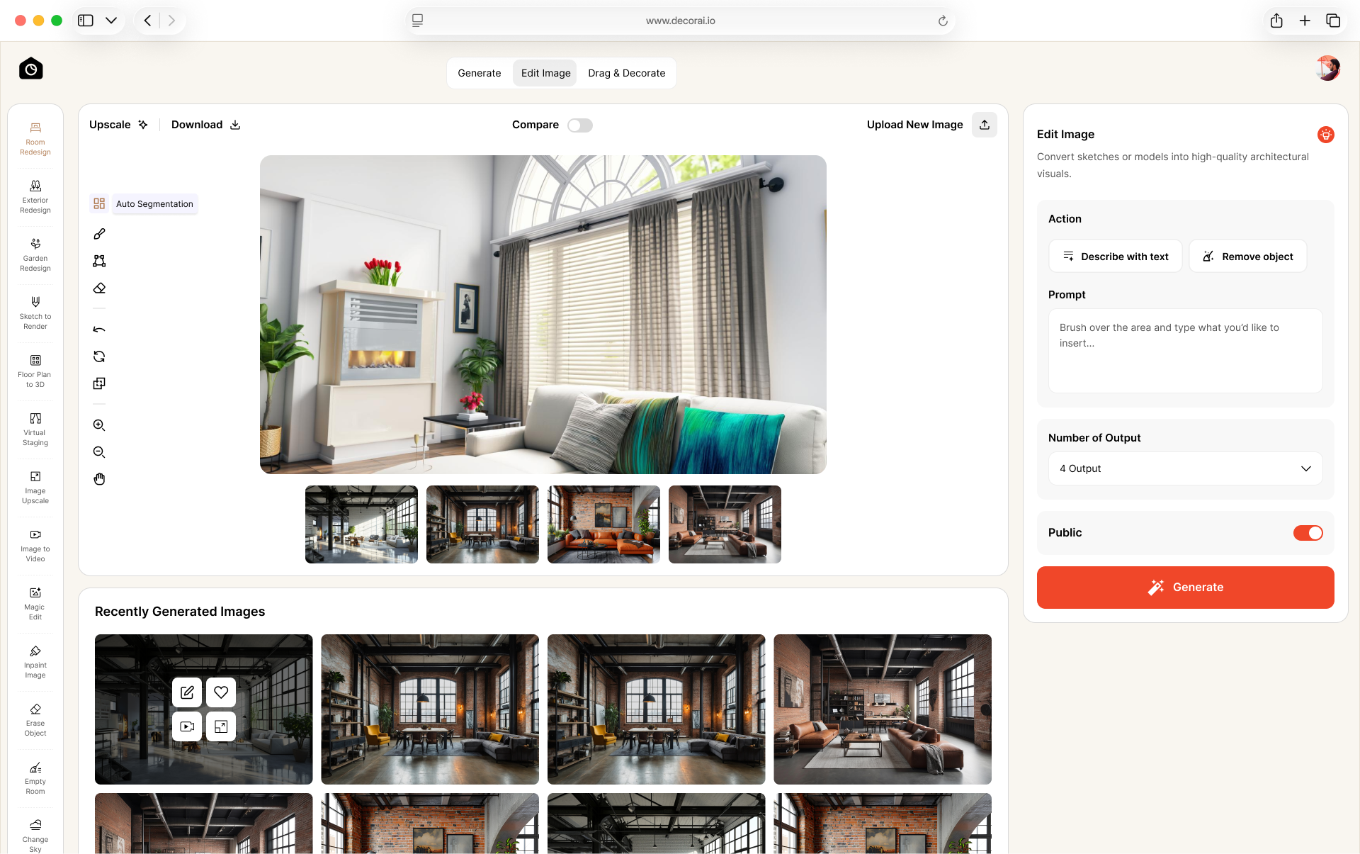
DecorAI's Relight tool does exactly this. Upload one photo of the room, then switch the same shot between Warm White (2700K), Neutral Daylight (4000K) and Cool Blue (6500K) and watch how far the wall color moves. It will not replace taping a real swatch above the baseboard, but it tells you which times of day are worth testing.
Using a Compass to Your Advantage
The direction a room faces does more than influence how well a houseplant grows throughout the year. This may be an essential consideration if you want greenery in the room to complement or contrast any color choices.
A west-facing room will have distinctly different light from a north-facing room, changing how natural light appears in the space. While direction matters, the size of the available windows will affect how much you can take advantage of the sun and the fullness of your color scheme. The sun's position affects architecture and interior design in several ways.
Many homes are built to account for the sun's natural movement, incorporating elements such as a long east-west ridgeline to capitalize on the bright warmth of southern sunlight. These rooms will be inviting, though potentially vibrant to the point of intensity, depending on color choices. North-facing rooms receive more indirect light, which can make them appear darker or cooler. East- and west-facing areas will look more varied throughout the day.
If you want to accommodate these natural-light trends, consider the following:
- North-facing rooms can use tones like warm grays to avoid the naturally cooler light from making the area feel too cold.
- South-facing rooms may use bright colors, while understanding that they will be amplified at the hottest points of the day.
- East- and west-facing rooms can have colors that look good in warm and cool light, such as neutrals.
Embracing the Power of Metamerism
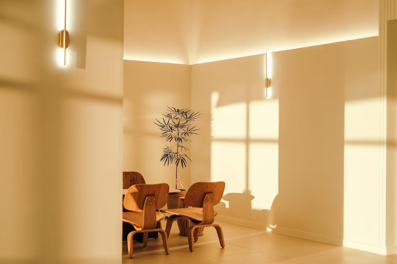
Metamerism is the phenomenon in which a color can appear as different shades depending on the type of light illuminating it. You can see it with paint and textiles, as well as with flooring and finishes.
This happens because a surface's color can shift depending on the light source it's exposed to. A wall that looks vibrant under warm afternoon sun may look flat and drab under the cooler light of a winter evening, even though the paint color itself hasn't changed at all.
The effects will force homeowners to consider not only how the sun affects their space, but also how it influences every decorative piece and piece of furniture, changing the light in the environment due to their reflective and absorptive properties. A color can even look different simply because of the hues around it , a wall next to a bold, saturated piece of furniture may read differently than the same wall on its own.
The hue will rarely look exactly like the swatch under all conditions, much less look the same as it did in the store. You may paint a home in early construction without installing the chandelier or adaptive smart lights yet, only to be surprised when the result does not look the way you intended.
Avoid misunderstandings of a color's appearance by painting a swatch or a movable board the same color as the existing wall. Move it around the room at different parts of the day, noticing how its appearance changes. Differences could be slight or dramatic, but this will give you a better idea of how it will appear across the environment.
Maximizing the Color Rendering Index (CRI) Influence
The CRI measures how accurately a light source renders color compared to how that same color appears under natural daylight. The scale runs from 0 to 100, with 100 meaning colors appear exactly as they would in natural light, and light sources with a CRI of 80 or higher are generally considered good enough for everyday interior spaces. A low CRI bulb can make colors look dull, muted or slightly "off" compared to how they appeared in the store or under daylight.
Different types of bulbs tend to fall into various CRI ranges. For example, the appearance of fluorescent bulbs will affect color differently than halogen bulbs. Each technology may have an average CRI range to refer to, indicating you will have a better chance of seeing colors accurately with specific bulbs.
You will want to maximize predictability, especially in spaces like dressing rooms and kitchens where visibility is nonnegotiable. Alternatively, a dark accent wall in these areas could add much-needed depth to a pale space.
You may also want to incorporate more natural light to compensate for the CRI. An installation like a skylight helps disperse tons of natural light into a room. The position makes the light distribution appear softer and warmer, which can adjust the aesthetics and appearance of paint against artificial lighting.
Painting Finish Affects Your Color's Character
Finish plays with color in more ways than one, depending on the material you observe. For example, paints have multiple finishes, including satin, gloss and matte. Someone could paint three walls in the same color with different finishes, and each one would look slightly different. This is because a glossy sheen can reflect light, whereas an eggshell or matte finish may feel muted yet deep.
The way paint plays with floor finishing is also important. Some wood treatments, like polyurethane, can change the hue of any wood or stain over time. Several coatings may even have a naturally warm tone, which would influence paint choices as well.
The effect these finishes have often inspires DIYers and designers to use a mix. Glass adds a nice shine and pop of intense color on trim and mantelpieces, while a matte finish is ideal for a consistently flat and imperfection-free appearance for the larger parts of the wall. Finding a happy midpoint between these can create a more dynamic room.
Considering How Furnishings Play With Color
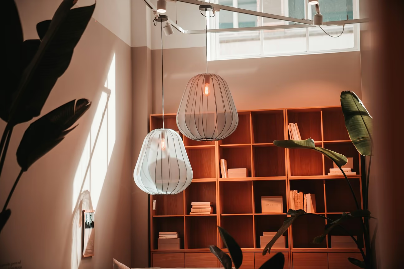
A paint color may look like it only stays in one place, but it actually scatters as light weaves throughout a space. A black end table will play with the cream wall differently than if the furniture were painted navy blue or red. The brain perceives these colors and their contrast, and it can notice how a color juxtaposes with or enhances surrounding tones, whether cool or warm.
Test this theory out to see how much it impacts your vision of the space, as some choices may suit certain aesthetics. For example, some styles, such as Nordic-inspired design and furnishings, are minimal and maximize natural light for a crisp, warm look.
You can also experiment by placing a warm-toned blanket on a cool-colored sofa. Question how this blanket looks here versus on the orange ottoman. Light coming in from the window will also play a role. If you are surrounded by tons of greenery or have an unimpeded view of a bright blue sky, these will change how furnishings look against any paint.
Frequently asked questions
Each wall gets a different amount of light. A wall near a window may get more direct light, while another wall may get softer light from the room. The paint is the same, but the light makes it look different.
Test it at different times of day. Check the color in the morning, midday, afternoon, and evening. If you use the room mostly at night, also check it under the lights you normally use.
A paint chip is small and is usually viewed under store lighting. Your wall is much larger and is affected by your room's daylight, bulbs, furniture, and flooring. For a better idea of the color, test a sample on the actual wall.
A paint color can look stronger and darker when it covers a large wall than it does on a small sample. The amount of light and the colors around the wall can also change how it looks. Always check a larger sample in the room before painting the whole wall.
Yes. Warm light can make colors look more yellow or warm, while cool light can make them look more blue or gray. Check your paint color under the lights you normally use in the room.
Yes. Gloss and satin finishes reflect more light, so the color can look brighter and change more as the light changes. Matte finishes reflect less light and usually give the color a softer look. Consider the paint finish as well as the color when testing paint.
North-facing rooms usually get cooler, indirect light, while south-facing rooms usually get stronger natural light. East-facing rooms tend to get warmer morning light, while west-facing rooms get warmer light later in the day. This can affect how warm or cool a paint color looks.
Yes. Fresh paint can look uneven or different while it is still drying. Let the paint dry fully before judging the color, especially after applying a second coat. The final color can look different from the wet paint.
No. An AI paint visualizer can help you see how a color or design idea might look in your room, but it cannot guarantee the exact final color. Your screen, room lighting, paint finish, and real wall surface can all affect the result. Use the visualizer to narrow down your choices, then test a real paint sample on the wall before buying the paint.
Tricking the Light
What looks like the perfect shade at the hardware store may appear in countless ways when applied at home. Everything from the sun's rays to LED lights can affect how a paint color looks across a building, and anticipating the many ways this occurs can prevent headaches and misunderstandings in your interior design choices. Use these tips to ensure you have the most accurate perception of a paint color before committing.